
workspace
At Roger Williams University, all online communication between students and professors is done through a site called Bridges. Here, announcements, quizzes, resources, assignments, grades and even personal messaging between students and faculty take place. On paper, Bridges is a great system, but in practice it is complex confusing, and causes issues for both students and professors.
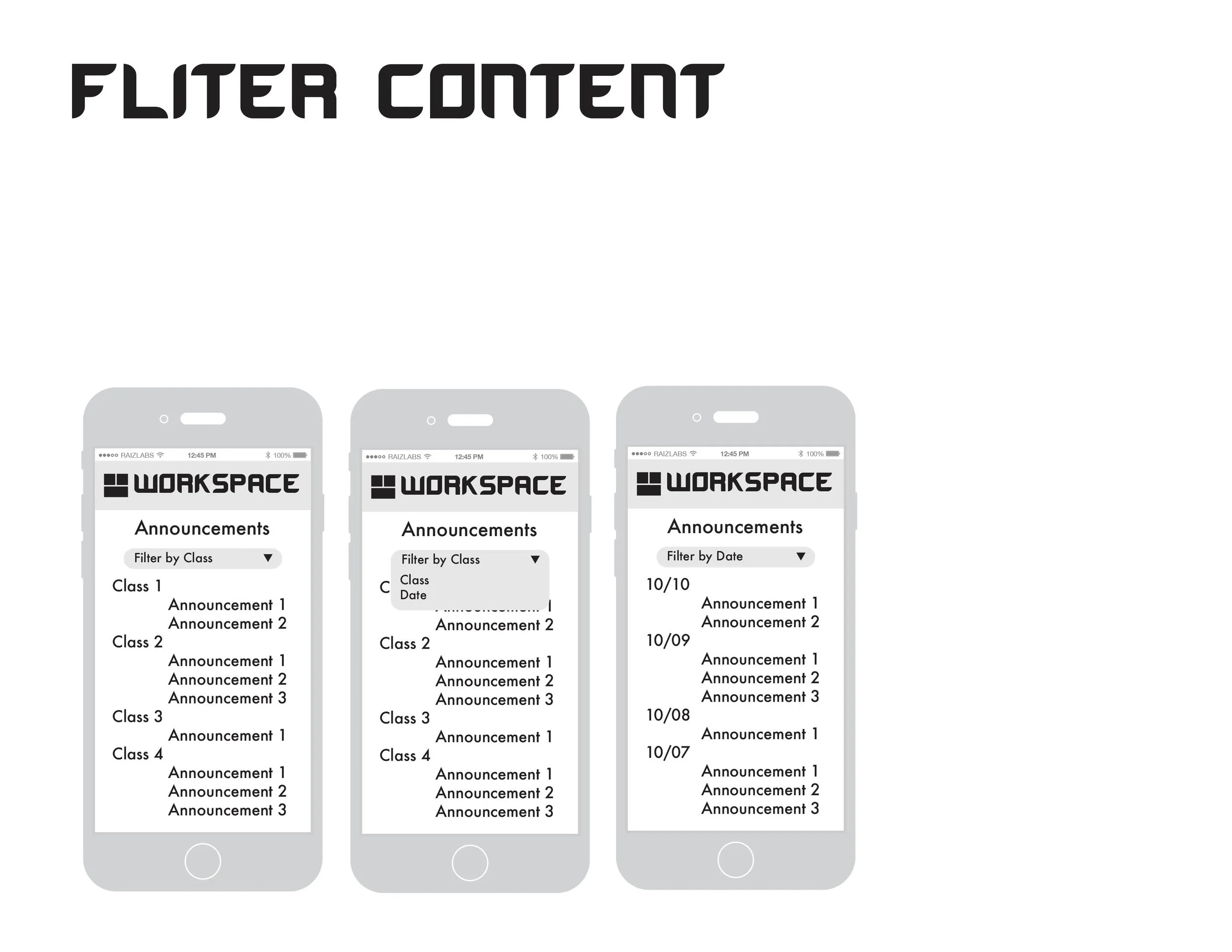
Part of a good website is to be intuitive enough so that its easy to navigate, with little to no instruction. As part of my UX/UI design course at RWU, my design partner, Richard Keach, and I set out to improve the user interaction by designing a more user friendly mobile experience, after having realized that most of the interaction through bridges occurs on a mobile platform. Through user testing Richard and I identified various opportunities through which we could improve the overall interaction such as navigation and customization, learning that sometimes the most important feature for a user is being able to play around without the fear of getting trapped on a screen or disrupting a task flow.
To test the intuitiveness of our prototype I created task flows using Figma, Sketch, and Invision to conduct A B testing.

Taskflow demonstration of our conceptual application’s interface utilizing inVision
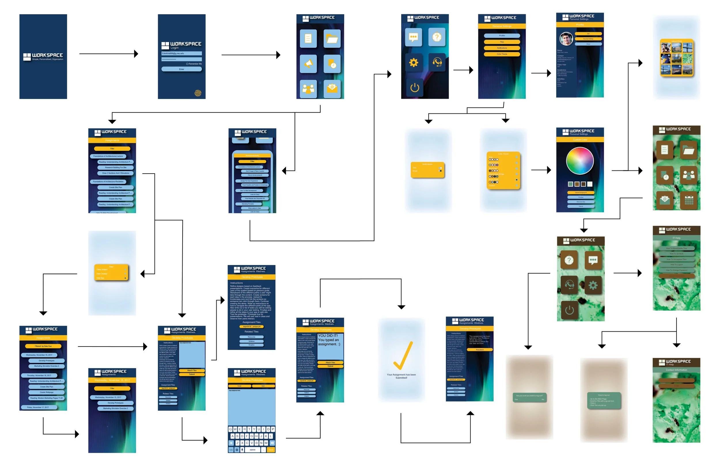
WIRE FRAMED SCREEN NAVIGATION/TASK FLOWS


WIREFRAME OUTLINE PRESENTATION


STYLE GUIDE


The month long project required my group to create a persona that resembled the average student, two wireframes, three prototypes, multiple design channels, a style guide, and a creative brief. Ultimately, we presented our project to the heads of media tech and the web developers behind the Bridges website, who integrated some of our features such as the student profiles into the new website, Roger Central.


TO USE OUR FINAL APP PROTOTYPE, CLICK THE LINK BELOW TO OPEN IT IN INVISION